![]()
Presenting ideas in to a PowerPoint presentation could be quiet difficult for the others.There may be the tendencies to write all the words inside a single slide. Some may even put images to put some aesthetics to the slide. But are these practices contribute to the learning from the slides or even to the presentation per se? What are some ways of presenting ideas through slides effectively?
In this post, you will learn some tips on how to create effective and powerful PowerPoint presentation.
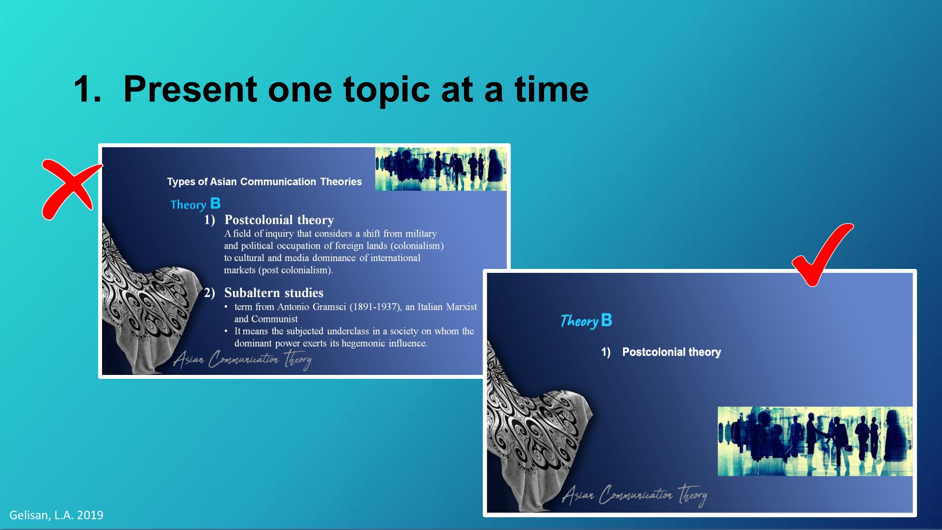
What should be displayed on the screen is the topic being talked about. For instance, you might want to use bullet points to present the subtopics. If you do this, present the bullets one at a time. You can do this by using the animation features of the PowerPoint. Charts can be put on the next slide to be referenced when you get to the data the chart displays.
Remember the acronym USE-B. Lamb (2005) stated this 4 principles of designing projected materials:
- First is Unity. It is important that you give your audience/learners the feeling of cohesiveness so they can understand your talk better. The use of uniform or consistent color pallette, font style, borders, lines, icon, bullet points, and the like would help you make your slides look cohesive.
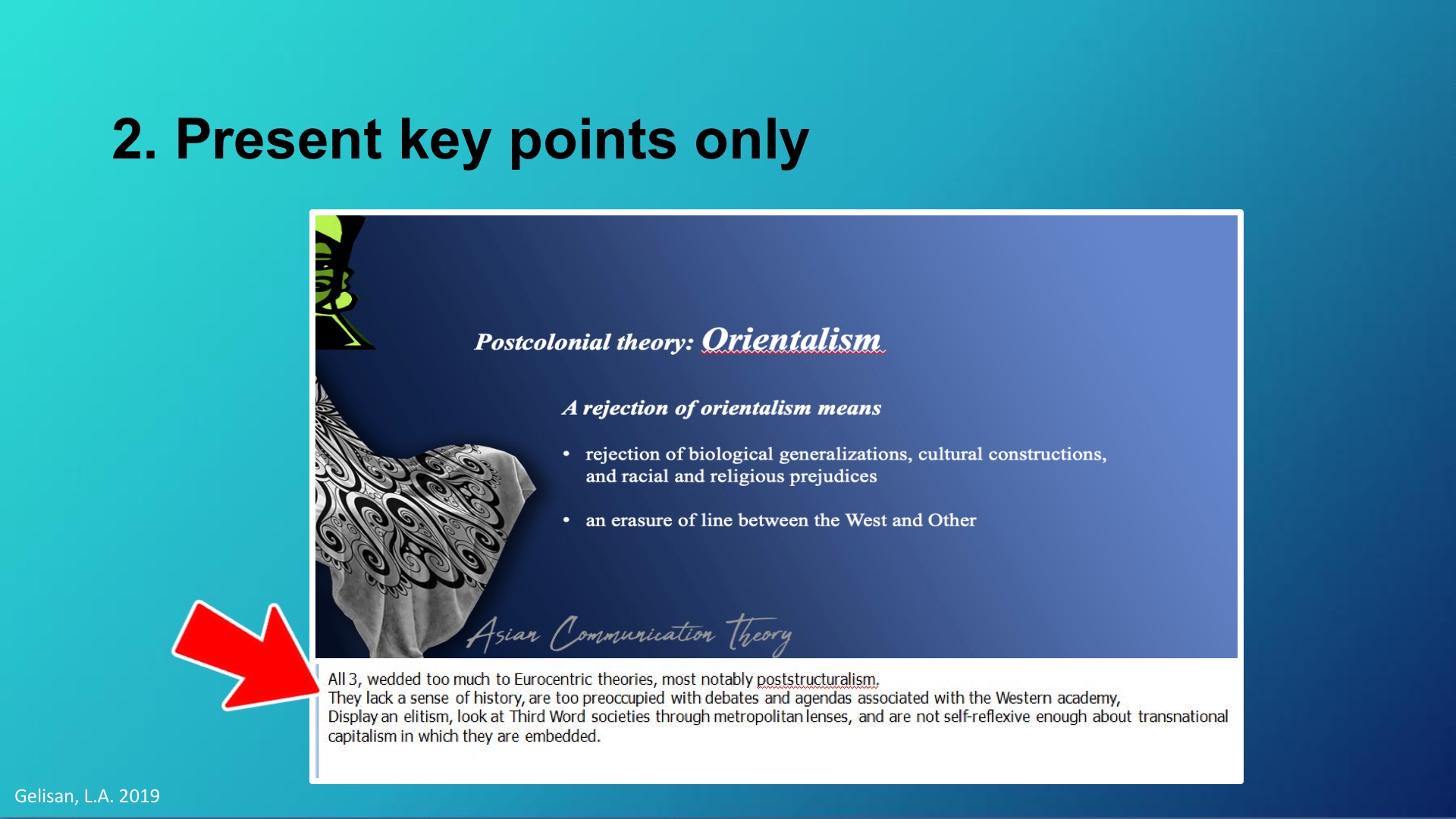
- Second is Simple. Remember the old sayings: “the simpler the better” or the acronym KISS “Keep It Short and Simple”. Do not put any design that are irrelevant to your content, this would just give your audience/learners confusion.
- Third is Emphasis. Aside from giving your slide a cohesive look, it is also vital to provide your slide contents emphasis. This would help you convey your message or ideas easily. Lamb (2005) suggested that you may use the Rule of Thirds in designing your slides.
- Last is Balance. It is important that your design elements together with your texts are balance. You may use Formal Balance in designing your slides. This is designing your elements in the slides symetrically.
You can use the following in planning your style sheet:
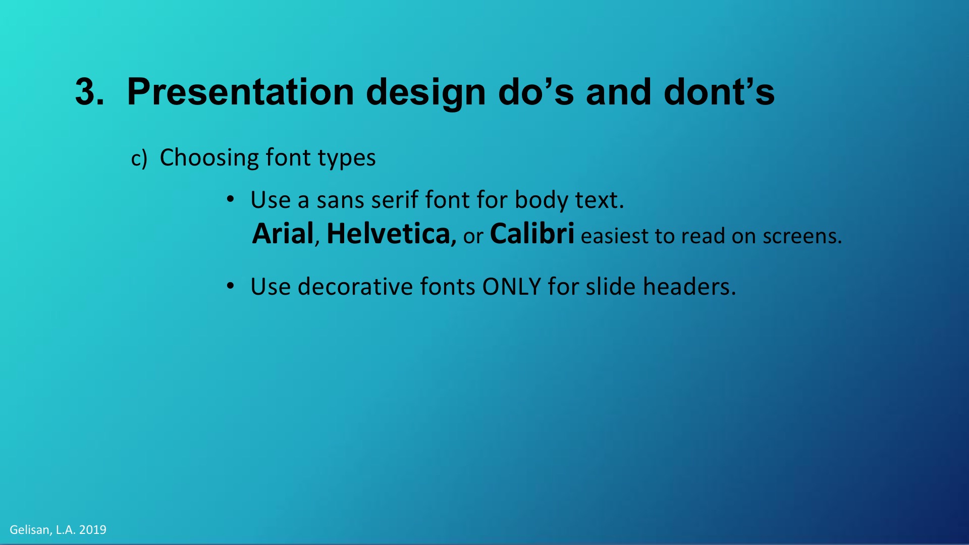
- Use Sans Serif Font Family for your body text. San Serif fonts like Arial, Helvetica, or Calibri tend to be the easiest to read on screens.
- Use decorative fonts only for your slide headers. But avoid too much decorative fonts such as calligraphies, script, hand writing, futuristics, etc, when this are not depicting what you are trying to say. The easy to read decorative fonts are the classy Serif fonts like Georgia or Baskerville.
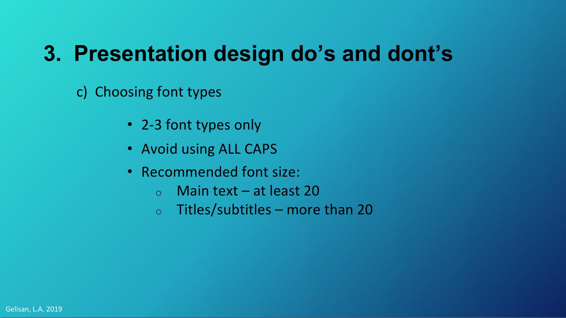
- Remember to be consistent. Stick to two, or at most, three font style for the whole presentation.
- Avoid using all capital letters as they are difficult to read and might connote shouting.
- Use 24 points font size or larger for your body text and 36 points font size for your headings.
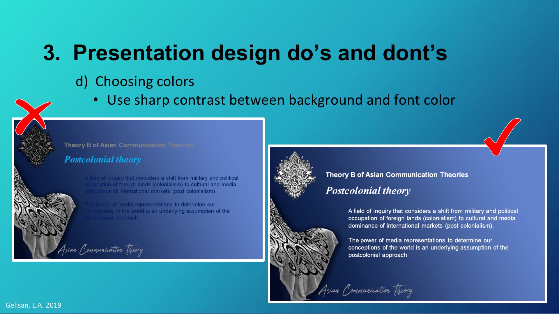
- Use sharp contrasting colors between the background and the font. Put dark text on a light background. This is easiest to read. Or you can use light colored text over a dark background.
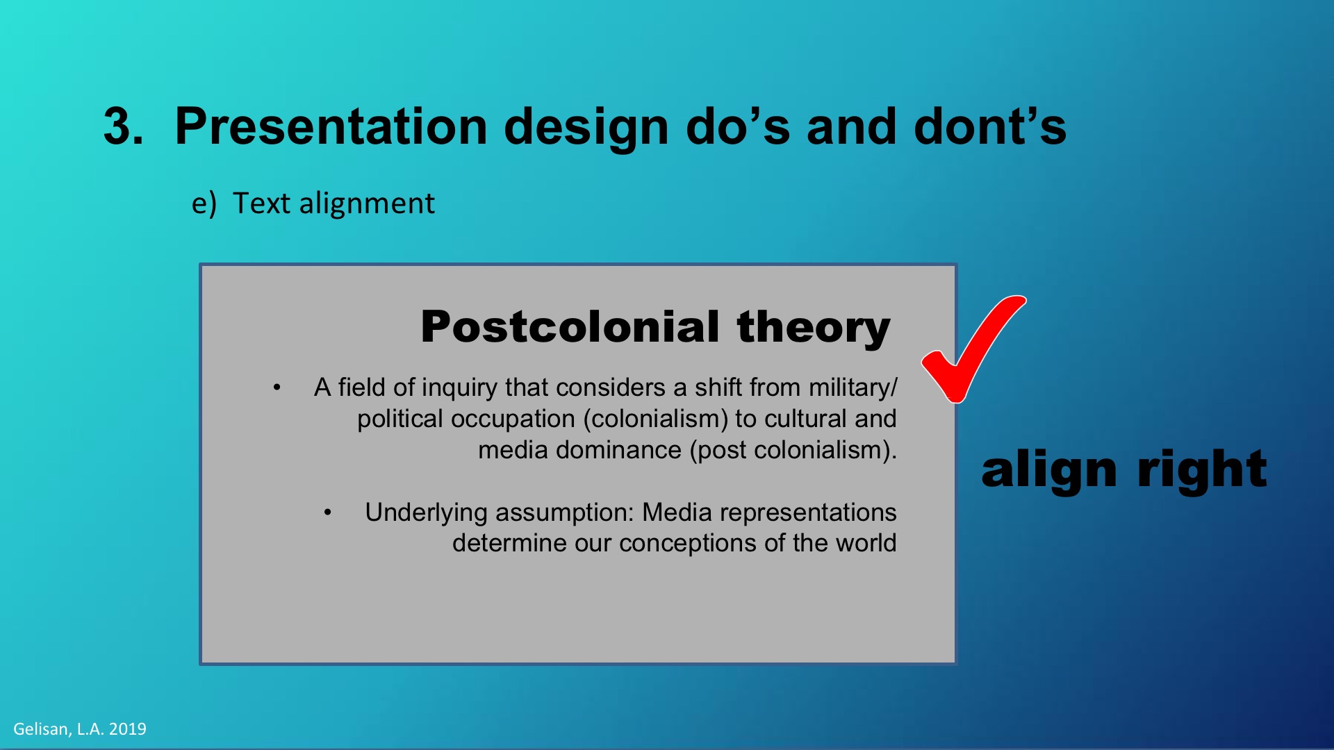
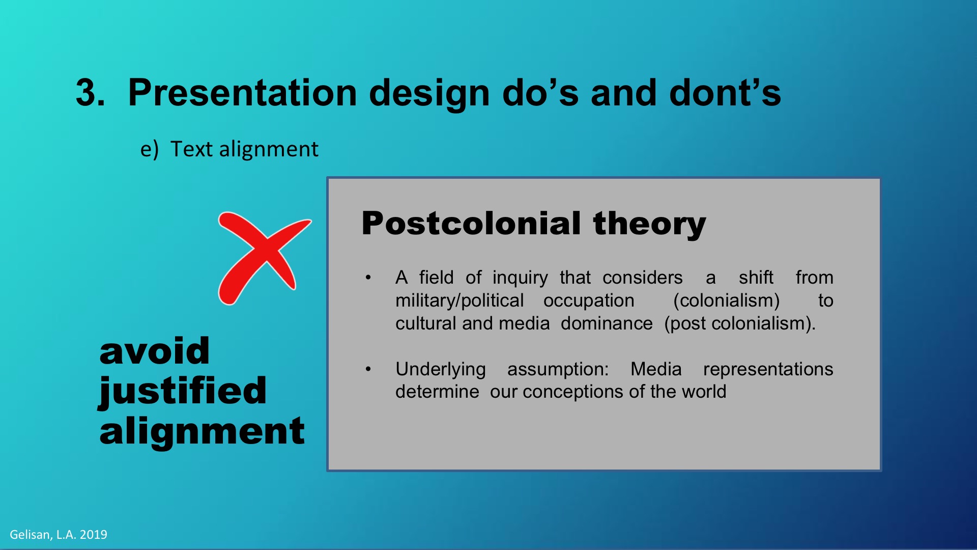
- Align your text left or right. But not centered nor justified. Though this may be pleasing to the eye, centered or justified text are harder to read and are not inclusive.
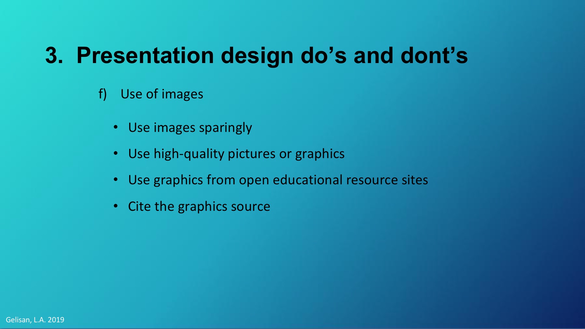
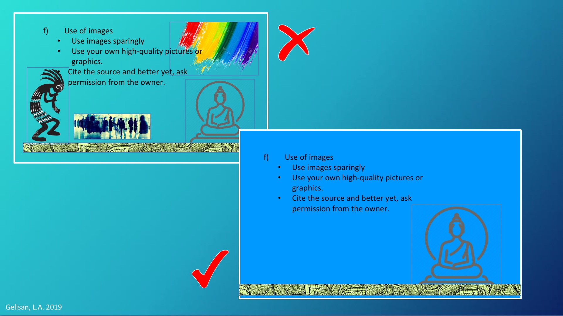
Use images only when they add information or make an abstract point more concrete. If possible avoid using PowerPoint’s built in clipart. Use your own high-quality pictures or graphics.
If you must use images from the Internet, make sure they are from open educational resource sites or are not copyrighted, especially if you will share your powerpoint online.
If you will use copyrighted materials, site the source and better yet, ask permission from the owner.
For the animation, you can use the most simple, subtle, and professional animation. You can use as simple as the “appear” animation.
For the transition between slides, use no more than one type pf transition effects. Again, look for the simplest effects.
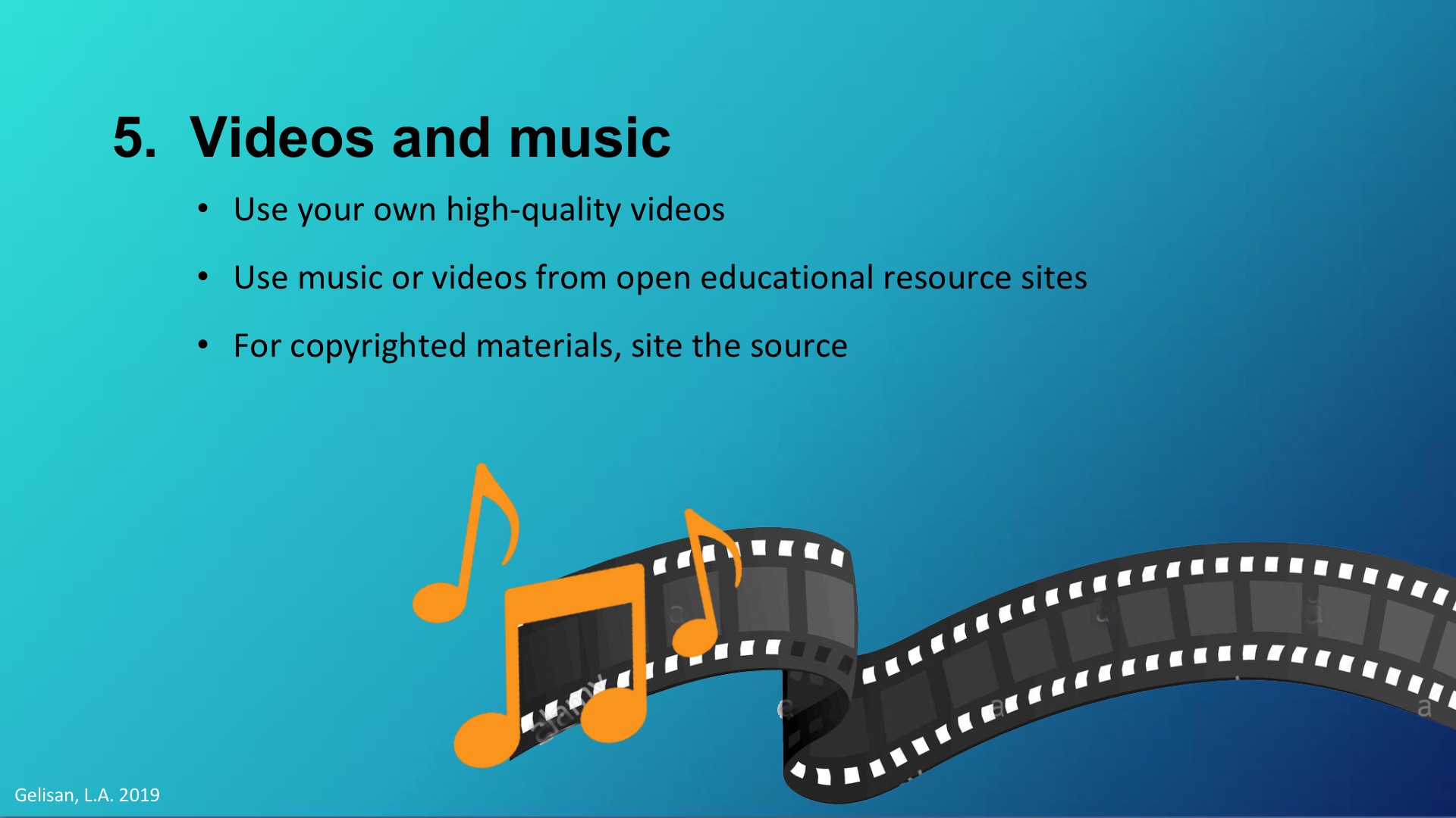
However, you must be aware of the copyright of the materials you are using. As much as possible, use your own quality video. If you use music or videos from the Internet, make sure they are from open educational resource sites or are not copyrighted. If you will use copyrighted materials, site the source and better yet, ask permission from the owner.
Key tip: Use creative common licesence materials and do what the cc licences entail. For more information about creative common licensence you can visit this learning resource: https://networks.upou.edu.ph/23294/creative-commons-and-sharing-in-the-digital-age-ms-paula-filart/.
Lamb, A. (2005). Designing and developing resources: Projected materials (Chap 9). In
Building treehouses for learning: Technology in today’s classrooms. Retrieved at
http://eduscapes.com/treehouses/TL9projected.pdf
Reynolds, G. Top 10 Slides Tips. http://www.garrreynolds.com/preso-tips/design/
Russel, W. 10 Font tips for presenters. http://presentationsoft.about.com/od/powerpointinbusiness/tp/bus_pres_tips.htm
Wax,D. 10 tips for a more effective powerpoint presentations. http://www.lifehack.org/articles/featured/10-tips-for-more-effective-powerpoint-presentations.html

